Most small business owners pour time and money into getting people to their website. They run ads, post on social media, and maybe even invest in search engine work. But here’s the uncomfortable truth: traffic alone doesn’t pay the bills. If your site gets 1,000 visitors a month and none of them pick up the phone or fill out a form, you don’t have a traffic problem. You have a conversion problem.
Your website should work like your hardest-working employee: greeting people, answering their questions, building trust, and guiding them toward a decision. Think of it less like an online brochure and more like a 24/7 sales staffer. The goal is simple: turn the visitors you already have into paying customers. That’s what this guide is about. Each section below tackles a specific piece of the puzzle, from how your site looks and feels to how you follow up with people who aren’t ready to buy yet. If you’ve been frustrated by a website that gets clicks but not clients, you’re in the right place. That’s a common spot to be, and it doesn’t mean your business is broken.
Optimize User Experience and Site Navigation
The way your website feels to a visitor matters just as much as what it says. People form an opinion about your site in less than a second. If it’s slow, confusing, or hard to use on a phone, they’ll leave before they ever read your headline. Good user experience removes the invisible walls between a visitor and the action you want them to take.
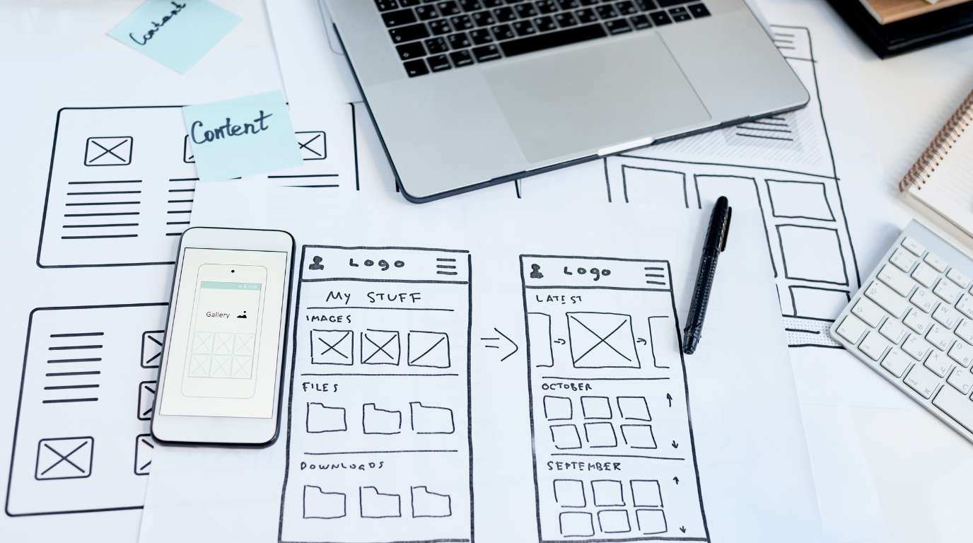
Think of your website like a physical storefront. If a customer walked in and couldn’t find the front counter, they’d walk right back out. Your site navigation should be that obvious. Limit your main menu to five or six items. Make sure someone can find your contact information within three seconds and understand what you do within ten. These aren’t arbitrary rules: they’re based on how real people behave online.
Improve Page Load Speed and Mobile Responsiveness
Speed is non-negotiable. If your site takes longer than three seconds to load, roughly half your visitors will leave. Google’s own data backs this up. You can check your current speed with free tools like Google PageSpeed Insights or GTmetrix. Common fixes include compressing images, removing unnecessary plugins, and choosing a faster hosting provider.
Mobile responsiveness is equally critical. Over 60% of web traffic now comes from phones and tablets. If your forms are too small to tap, your text is hard to read, or your pages scroll sideways, you’re losing people. Don’t just trust a “mobile-friendly” label in your website builder. Pull out your phone and test every page yourself, especially your contact form and any lead capture pop-ups. Tap every button. Fill out every field. If anything feels clunky, fix it or have it rebuilt.
Simplify the Path to Purchase
Every extra click between a visitor and a conversion is a chance for them to leave. Map out the journey from your homepage to your contact form or checkout page. How many steps does it take? Can you cut any of them?
A service-based business, for example, might have a homepage that links to a services page, which links to a specific service, which finally has a “Request a Quote” button. That’s four steps. You could cut it to two by placing a clear call to action right on the homepage. Put yourself in your visitor’s shoes: they showed up because they have a problem. Show them you can solve it, and give them a fast way to reach you.
Craft Compelling Copy and Calls to Action
Words do the selling on your website. Design gets attention, but copy closes the deal. The biggest mistake most small business sites make is talking about themselves instead of talking to the customer. Your visitor doesn’t care about your company history. They care about whether you can fix their problem.
This is where a StoryBrand approach pays off. Position your customer as the hero, and your business as the guide. Your copy should name their problem, show empathy, and then present a clear plan. When you do this well, visitors feel understood, and people buy from businesses that understand them.
Write Benefit-Driven Headlines
Your headline is the first thing people read, and often the last. A weak headline like “Welcome to Our Website” tells the visitor nothing. A strong one like “Get a Clean, Pest-Free Home Without Lifting a Finger” tells them exactly what they’ll get.
The formula is straightforward: lead with the result your customer wants. Compare “Our Accounting Services” to “Stop Worrying About Tax Season: We Handle Everything.” The second version speaks to a feeling and a benefit. Write three to five headline options for your most important pages, then test which one gets more engagement. Specific beats vague every time.
Design High-Contrast CTA Buttons
Your call-to-action buttons are the most important elements on any page. They need to stand out visually and use language that makes people want to click. A button that says “Submit” does almost nothing. A button that says “Get My Free Quote” creates a sense of ownership and value.
Use first-person phrasing on your buttons: “Start My Free Trial” outperforms “Start Your Free Trial” in most tests. Make the button color contrast sharply with the rest of the page. If your site is mostly blue, try an orange or green button. Place CTAs above the fold on every key page, and repeat them after major sections of content. Don’t make people scroll to find the next step.
Build Credibility Through Social Proof
Trust is the currency of online business. A visitor who doesn’t trust you will never become a customer, no matter how good your offer is. Social proof, which includes reviews, testimonials, logos, and certifications, acts like a shortcut to trust. It tells new visitors, “Other people took a chance on this business, and it worked out.”
Leverage Customer Testimonials and Case Studies
Not all testimonials are equal. A generic quote like “Great service!” doesn’t move the needle. A specific one like “RedWeb.Digital rebuilt our site in three weeks, and we saw a 40% increase in consultation requests the first month” tells a story and addresses a real concern.
Place testimonials strategically. If a visitor is on your pricing page, they’re probably wondering about value. That’s where you put a testimonial about return on investment. If they’re on your services page, use a quote about quality or speed of delivery. Match the testimonial to the objection the visitor is likely feeling at that exact point. Case studies work even better because they show the full picture: the problem, the solution, and the result.
Display Trust Badges and Certifications
Trust badges are the digital version of hanging your diploma on the office wall. They signal credibility at a glance. These include security certificates (like SSL), industry certifications, payment processor logos, and review platform ratings.
For service-based businesses, badges from recognized organizations carry real weight. A Google 5-star rating badge or a certification from the Digital Marketing Institute tells visitors that your expertise has been verified by a third party. Place these near your conversion points: beside your contact form, on your checkout page, and in your website footer. The closer they are to the moment of decision, the more impact they have.
Use Lead Magnets to Nurture Prospects
Not every visitor is ready to buy today. Some are researching, comparing, or just not sure yet. A lead magnet gives those people a reason to share their email address so you can stay in touch. In plain terms, you’re trading something valuable, like a guide, checklist, or template, for permission to follow up.
This is one of the most effective ways to convert website visitors into customers over time rather than losing them forever after a single visit.
Create High-Value Gated Content
The key word here is “value.” Nobody wants another generic PDF. Your lead magnet should solve a specific, small problem for your ideal customer. A plumber might offer a “Seasonal Home Plumbing Checklist.” A marketing agency might offer a “15-Point Website Audit Template.”
Keep the format simple. A one-page checklist or a short video series often outperforms a 30-page ebook because it’s easier to consume. Gate it behind a short form: name and email are usually enough. Every extra field you add reduces the number of people who complete it. Use progressive profiling if you want more data later, which means asking for additional details over time instead of all at once.
Implement Automated Email Sequences
Once someone downloads your lead magnet, don’t let the relationship go cold. Set up an automated email sequence that delivers value over the next week or two. The first email delivers the promised content. The second might share a relevant blog post or tip. The third could include a case study. By the fourth or fifth email, you’ve earned enough trust to make a direct offer.
Keep each email short and focused on one idea. Write subject lines that create curiosity or promise a benefit. And always include a clear next step, whether that’s reading a post, watching a video, or booking a call. This sequence does the nurturing work for you while you focus on running your business.
Reduce Friction in the Checkout Process
If you sell products or take payments online, your checkout process is where deals are won or lost. Cart abandonment rates average around 70% across industries. That means seven out of ten people who start a purchase don’t finish it. Most of the time, it’s not because they changed their mind. It’s because something in the process annoyed or confused them.
Offer Guest Checkout Options
Forcing someone to create an account before they can buy is one of the fastest ways to kill a sale. Many visitors are first-time buyers. They don’t want to remember another password. Offer a guest checkout option that lets them complete the purchase with just their email and payment info.
You can always invite them to create an account after the sale is complete, when they’re already committed. Frame it as a benefit: “Create an account to track your order and get 10% off next time.” This approach respects the customer’s time and removes an unnecessary barrier.
Provide Multiple Payment Gateways
People have strong preferences about how they pay. Some trust PayPal. Others prefer Apple Pay or Google Pay. Many still want to type in a credit card number. If you only offer one option, you’re excluding everyone who prefers something else.
Adding two or three payment methods is usually straightforward with modern e-commerce platforms. Display the accepted payment logos clearly on your checkout page so visitors know their preferred method is available before they start filling in forms. This small detail can recover a surprising number of abandoned carts.
Analyze Data to Refine Conversion Strategies
You can’t improve what you don’t measure. Gut feelings are useful, but data tells you what’s actually happening on your site. The businesses that consistently turn more visitors into clients are the ones that test, measure, and adjust based on real numbers.
Utilize Heatmaps and User Recordings
Heatmap tools like Hotjar or Microsoft Clarity show you where people click, how far they scroll, and where they get stuck. This is like watching a customer walk through your store and seeing exactly where they pause, what they pick up, and where they turn around.
User recordings go a step further by letting you watch actual visitor sessions. You’ll often spot issues you never would have guessed: a button that looks clickable but isn’t, a form that’s confusing, or a section of content that everyone skips. Review a handful of recordings each week and look for patterns. If three out of five visitors abandon your page at the same spot, that’s where your problem lives.
Run A/B Tests on Key Landing Pages
A/B testing means showing two versions of a page to different visitors and seeing which one performs better. You might test two different headlines, two button colors, or two page layouts. The key is to change only one thing at a time so you know what caused the difference.
Start with your highest-traffic pages, since those give you results fastest. Even small improvements compound over time. A 1% increase in conversion rate on a page that gets 5,000 visitors a month means 50 more leads per month, or 600 more per year. Tools like Google Optimize or VWO make this process accessible even if you’re not technical.
Frequently Asked Questions
What’s a good conversion rate for a small business website?
Most small business websites convert between 2% and 5% of visitors. If you’re below 2%, there’s likely significant room for improvement. Service-based businesses that follow the strategies above often push past 5%.
How long does it take to see results from conversion changes?
Some changes, like fixing a broken form or speeding up your site, can show results within days. Others, like email nurture sequences, take weeks to build momentum. Expect to see meaningful trends within 30 to 90 days.
Can I fix my conversion rate without redesigning my whole site?
Minor tweaks can help temporarily, but if your site is outdated, unclear, or slow, a strategic redesign is usually the real fix. Band-aid solutions rarely deliver lasting improvement.
Do I need expensive tools to track conversions?
No. Google Analytics is free and powerful. Microsoft Clarity offers free heatmaps and session recordings. You can get started with zero budget and upgrade tools as your needs grow.
Should I hire a professional or try to do this myself?
You can handle some basics on your own, like writing better headlines or adding testimonials. But for a comprehensive approach, working with a team that specializes in conversion-focused web design, like RedWeb.Digital, can save you months of trial and error.
Turn Visitors into Clients: Your Next Move
Every section above targets a specific leak in your conversion funnel. Speed and mobile experience keep people from bouncing. Clear copy and strong calls to action guide them forward. Social proof builds the trust they need to take action. Lead magnets capture the ones who aren’t ready yet. A smooth checkout removes last-minute hesitation. And data shows you where to focus next.
Pick one area where you know your site is weakest and tackle it this week. Small, focused improvements add up fast.
If you’d rather have a team handle this for you, RedWeb.Digital builds websites designed to attract the right visitors, earn their trust, and turn them into real leads around the clock. Get started here and see what a conversion-focused site can do for your business.